
ResponsiveGrid
Description
A collection of CSS classes with abbreviated naming to help fast creation of grid layouts, using floating divs with proportional width adapting to various device widths, including single column layouts for mobiles in portrait orientation.
Installation
Copy grid.cssΔ to pub/css/ folder and add this line to the beginning (before any normal css rules) of pub/css/local.css:
@import 'grid.css';
Configuration
Modify the css rules as and if needed, especially the @media rules may need adjusting to your requirements, as they trigger the breakpoints, at which the layout may change from single column mode to multiple columns.
Usage
(list of class names and their usage, with examples...)
Positioning divs into a responsive grid layout
These grid float classes are experimental, and I would love your feedback for improvement on this system! HansB
The skin offers a range of shorthand style classes for easy positioning and proportionally sizing divs into a grid system, all defined in the grid.css file. Content layouts with two, three and four columns or div boxes floating side by side can be created, as boxes with margins in between, or as tiles without in-between margins. On a mobile in portrait orientation these floats will be arranged in a single column. For instance
>>lf50<<- this will create a left-floating div with 50% width.
>>rf25<<- this will create a right-floating div with 25% width.
>>lf33 clear<<- this will create a left-float div with 33.33% width, and it will not float into space above (useful if it is the first floating div in a row).
>>lfx33<<- this will create a left-floating tile (no space between such tile divs) 33.33% wide.
All the grid float classes have padding, and classes like lf50, rf33 have a margin, so the boxes leave a little space in between. Classes like lfx50, rfx33 have no margin, so will look like tiles, touching each other. To easily remember: lf stands for left float, rf for right float, the attached number for the nominal percentage width, of which there are:
- 25, 50, 75: for four columns
- 33, 66: for three columns
- 50: for two columns
>>lfx25<<
left-float 25% wide div, no margin, border or background.
>>lf50 h6 bd p15 bgcolor=yellow<<
left-float 50% wide, 6 rows height, border, more padding (15px) background color yellow
>>lf25 center frame<<
25% wide div
text is centred
frame: border light gray background
>>lfx33 h6 bgcolor=#ffeeee clear<<
33% wide div tile
clear puts this on clear new row, otherwise it may float upwards, wrecking the grid layout.
>>lfx33 h6 center link<<
33% wide div tile acting as link
>>lfx33 h6 bgcolor=#eeefff<<
33% wide div tile
Other classes defined in grid.css:
margin-classes like rm2 (2% right margin) or lm3 (3% left margin), minimum-height-classes like h5 (ca. 5 text rows height), width-classes like w20 (20% width), image maximum-width-classes like iw20 (20% image maximum width) useful in style markup, padding-classes like p10 (10 pixel padding).
Boxes behaving as links (link boxes)
To make clickable/tappable div boxes or tiles we need a bit of javascript installed, for instance using the following code in config.php (The Amber skin already has the javascript snippet in its skin.js file):
$HTMLFooterFmt['linkbox'] = '<script>/* put click function to divs class=link */
  window.onload = function (){
   var lks = document.getElementsByClassName("link");
   for (var i = 0, len = lks.length; i < len; i++) {
     lks[i].addEventListener("click", function(){
        window.location.href = this.getElementsByTagName("A")[0].href;
     });
     lks[i].addEventListener("mouseover", function(){
         this.style.cursor = "pointer";
     });
   }
  }
</script>';
With javascript and grid.css in place, to create link box divs, which act as links when clicked or tapped, use style class link in a div markup, and put a link markup into it, plus optional text and optional image. Put other styles to the div if needed. If more than one links are part of the div, the first link will be used as the target when clicking anywhere on the box. The other links will work as normal.
An example for three link boxes floated side-by-side with lf33 float positioning classes from grid.css (33% wide left-float):
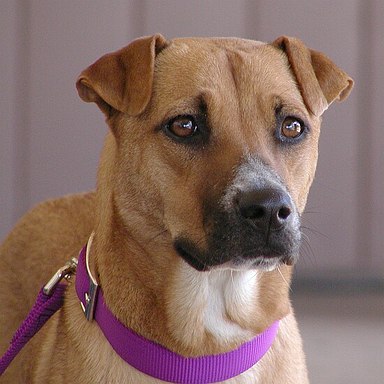
>>lf33 link<< %lf%Attach:HaleyDog.jpg !!![[PmWiki/Images]] Clicking or tapping anywhwere on this link-box will take you to page '''Images''' >>lf33 link bgcolor=white<< %lf%Attach:pmwiki-rollover.gif !!!![[Main/Home Page| beyond home...]] reaching far out with powerful flexible collaborative web design >>link center bgcolor=yellow<< [[Skins Gallery]]\\ simple text box >><< |
Skins Gallery |
The rf and lf style classes in front of an image inside a link class box adapt according to device width (narrow your browser window to see effect):
- for mobile portrait mode the image will be a third wide of the full-width box.
- for mobile landscape and other screens it will be half the width of the surrounding link box (which may well be less than full width, like half or third width of the content area)
- if it is used for an image inside 20% (fifth width) boxes, the image will not have text float beside it (as there is little space), but have text below it instead, when viewed in anything but mobile portrait mode.
Notes
grid.css was created as part of developing a mobile friendly skin. It could be used for other skins following RWD criteria, or just used for more flexible content layout. It will not turn any skin into a responsive skin, but may help a more responsive layout of content.
Change log / Release notes
- 2016-08-08: initial release
See also
- Skins.Amber#grid - grid.css is part of the Amber skin.
Contributors
Comments
See discussion at ResponsiveGrid-Talk
User notes : If you use, used or reviewed this recipe, you can add your name. These statistics appear in the Cookbook listings and will help newcomers browsing through the wiki.