Academian < Skins > Alalike (talk | users | test page | RWD? | set as default | unset | validate: HTML, CSS)
Version: 2017-09-26

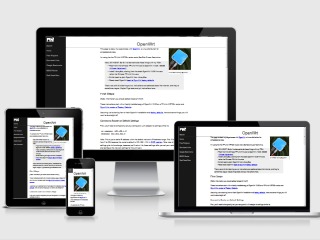
Adapts to the screen size
| Website View: | |
| Graphic Logo: | |
| Wikitext Font: | |
| Color Scheme: | |
(Menu colors change.)
Resize your browser to see it "adapt".
Note, for recent PHP versions, until the skin is updated, you may need to add to config.php this: $AdaptDemoViews = false; or true.
Description
Adapt Skin is a skin for desktops, mobile devices, and devices in between. The side menu turns into a hamburger menu on small/mobile screens.
The current version is installed here.
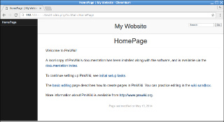
The development version looks like this. (Test Page & CSS)
Overview
This is a skin that adapts to screen size, from large high-resolution desktop displays through mobile phones. The side menu automagically switches to a hamburger menu on mobile devices. This skin has a big easy-to-read default font size for compatibility with modern high-density displays.

You can have a mobile-responsive PmWiki-powered CMS up and running in minutes.
This skin works well with the CMS Mode recipe, so read-only visitors will see a "site view" of the layout that has the look and feel of a normal website. Authors see a "wiki view" that includes the GroupName and wiki-related action links.
This skin and the CMS Mode recipe combine to make a powerful, fully-operational mobile-responsive PmWiki-powered Content Management System that can be up and running in minutes.
Try resizing resizing your browser window to see the layout "adapt".
Files
- AdaptSkin-latest.tar.gz (44K)
- AdaptSkin-latest.zip (48K)
- AdaptSkin-2017-09-26.tar.gz (44K)
- AdaptSkin-2017-09-26.zip (48K)
md5sums:
663ff129b7488e5de504669270cc9893 AdaptSkin-latest.tar.gz
1960eeadd6e54e5d95f0754c0925c442 AdaptSkin-latest.zip
663ff129b7488e5de504669270cc9893 AdaptSkin-2017-09-26.tar.gz
1960eeadd6e54e5d95f0754c0925c442 AdaptSkin-2017-09-26.zip
shasums:
1178761a9503fdb96e0ff1d11348a6b465bee778 AdaptSkin-latest.tar.gz
5e8e7c5c116a764e6eac11c453ced1c4b4716a2b AdaptSkin-latest.zip
1178761a9503fdb96e0ff1d11348a6b465bee778 AdaptSkin-2017-09-26.tar.gz
5e8e7c5c116a764e6eac11c453ced1c4b4716a2b AdaptSkin-2017-09-26.zip
Installation
The usual...
Unpack the skin to pub/skins/ inside your pmwiki folder and add the following to your local configuration file:
$Skin = 'adapt';
Upgrading
If you edit the template or .css files, be careful your changes don't get over-written when you upgrade the skin.
Configuration
Ordinarily there's nothing special to configure.
Skin Configuration File - adaptconfig.php
(still experimental)
The skin can have its own configuration file, either in $FarmD, /local, or the skin's directory. This allows
- less cluttering of config.php
- portable skin+configuration
- installable pre-configurations, e.g. color schemes.
Graphic Logo
The wiki's "logo" is text by default, however you can use a $PageLogoUrl graphic logo instead you prefer. (FAQ) Add this in your configuration file:
## Switch Adapt Skin to a graphic logo
if ($GLOBALS["Skin"] == "adapt" ) {
$PageLogoUrl = "$PubDirUrl/skins/adapt/Adapt-38.gif"; # logo image
$AdaptWikiLogoEna = 1;
}
If your logo file is in the /pub directory, be sure to adjust the path accordingly.
Settings
- $AdaptFavIconEna
- Enable the favorites/shortcut icon (e.g. favicon.ico). It's enabled by default. Set to
0orFALSEto disable the favicon. - $AdaptFaviconUrl
- URL of the favorites/shortcut icon (e.g. favicon.ico). Default is
$SkinDirUrl/adapticon.ico - $AdaptTouchiconUrl
- URL of the Apple iOS icon (apple-touch-icon.png). Default is
$SkinDirUrl/apple-touch-icon.png - $AdaptHomeTitleEna
- Setting this to
1orTRUEincludes the page's title in the <title> tag on the site's HomePage ($DefaultPage), otherwise the page title is suppressed for (only) that page. - $AdaptWikiLogoEna
- Setting this to
1orTRUEswitches from a "text logo" to a graphic logo. - $AdaptWikiTagline
- Setting this, as in
$AdaptWikiTagline = 'some tagline text';, causes a site tagline to appear below the logo. - $AdaptTagHomeOnly
- Setting this to
1orTRUEcauses the tagline to only appear for the site's home page ($DefaultPage). - $AdaptEditTitleEna
- Setting this to
1orTRUEenables displaying the page title on the edit page. - $AdaptEditHeaderEna
- Setting this to
0orFALSEdisables displaying the site header (masthead) on the edit page. - $AdaptMinCss;
- Setting this to
1or TRUE switches to the non-minified version of the adapt.css stylesheet. - $AdaptCustomStylesheet
- Filename of the custom CSS stylesheet. Default is
custom.css. - $AdaptPoweredByEna
- Setting this to
0orFALSEdisables the PoweredBy section in the page footer area. - $AdaptPoweredBy
- Replaces the PoweredBy string with a custom string.
- $AdaptDemoViews
- Setting this to
1orTRUEinclude()s thedemoviews.phpscript.
Shortcut / Favorites Icon
The skin has a bundled .ico icon, enabled by default. You can disable it with
$AdaptFaviconEna = 0;
If you already have a favorites icon (or decide to make your own), you can place it in your wiki's /pub directory and use that one.
$AdaptFaviconUrl = "$PubDirUrl/skins/adapt/adapticon.ico:
Mobile-Only (Improve Search Results)

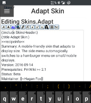
Edit on mobile
You can use this skin for mobile-only even if your default skin is another one for desktops. Doing so could significantly affect your content's discoverability.
Refer to Google's 2015 page about mobile-friendly Google search results for more information. This skin passes Google's Mobile-Friendly Test if you use the following browser-sniffing code. (Small screens smell different to servers. Who knew?!)
I hacked together the following browser-sniffing code that seems to work pretty well. Targets: Android, iOS, Windows Mobile, Blackberry, Kindle Fire
## Use Adapt skin on iOS, Android, and other mobile
if (preg_match('/Android|iPad|iPhone|iPod|Mobile|Phone|Kindle|Silk/',
 $_SERVER['HTTP_USER_AGENT'])) $Skin='adapt';
You could also use one of these recipes: (DetectMobile | DetectMobileFree).
Serif Text for Mobile Only
Fonts with serifs are more readable on high-pixel-density screens. You want to keep the default sans-serif text for desktops and deliver serif text on mobile displays (because modern mobile displays have high pixel density).
## Adapt Skin - Serif font in content area on iOS, Android, and other mobile
if ($GLOBALS["Skin"] == "adapt" &&
  preg_match('/Android|iPad|iPhone|iPod|Mobile|Phone|Kindle|Silk/',
  $_SERVER['HTTP_USER_AGENT'])) {
    $HTMLStylesFmt['adaptmobile'] = '
html, .pure-g [class *= "pure-u"] { font-family:
  Georgia, Times, "Times New Roman", serif; }
#menu, #wikilogotxt, #wikihead, #wikifoot, #wikicmds,
.title, .caption, h2, h3, h4, h5, h6, .sans { font-family:
  FreeSans, Arimo, "Droid Sans", Helvetica, Arial, sans-serif; }'."\n";
}
Floats in Mobile Mode
On small/mobile screens lfloat and rfloat wikistyles will leave some room for adjacent text in mobile mode (only). You'll probably want to leave it that way. If not, it can be revert to the default styles with:
## Remove Adapt Skin (l|r)float style modifications
SDV($HTMLStylesFmt['adaptfloatundo'], "
  .lfloat, .rfloat { max-width:100%; margin-bottom:0; }\n");
Notes
Origin
I searched far and wide for a relatively no-frills adaptive template of some sort, and eventually found this side-menu template with some BSD/MIT-Licensed JavaScript that I could use to make a skin for PmWiki.
This skin uses CSS and a small amount of JavaScript. There's a small PHP script. There are no bundled wiki pages.
The original CSS files are here: pure.css (minified) / side-menu.css / side-menu-old-ie.css.
Skin-specific wikistyles
This skin adds some wikistyles (still experimental):
- box
- Draws a box around the element like this.
- codebox
- Draws a box around the element and applies a monospaced font like this.
- highlight
- Highlights text like this.
- underline
- Underlines text like this.
Change Log / Release Notes
2014-05-25 - The initial release on PmWiki.org.
2016-10-03
- Reduced the file size of the apple-touch.png file.
- Added a minified copy of the adapt.css CSS stylesheet. Use it with
$AdaptMinCss = 1;.
2016-10-08
- The site's HomePage (
$DefaultPage, usually Main.HomePage) no longer has the page's title in the HTML <title> tag.$AdaptHomeTitleEna = 1;shows it. - Eexperimental - Added
.nomobileand.onlymobileCSS selectors for%nomobile%and%onlymobile%wikistyles. As you might suspect, these hides/show content on small and large screens.
2016-10-14
- Switching from a Text Logo to a Graphic Logo is now a setting.
- Old way was to deliver both to the browser and only display one.
- Now
$AdaptWikiLogoEna = 1;enables the graphic logo. - This change may require configuration change when you upgrade the skin.
- Added a new tagline feature
- If you set a tagline using
$AdaptWikiTagline = 'some tagline text';, it appears below the (text or graphic) logo. $AdaptTagHomeOnly = 1;displays the tagline only for the home page ($DefaultPage).
- If you set a tagline using
- Move .nomobile and .onlymobile styles from adapt.php to the stylesheet.
- Some other CSS stylesheet adjustments.
2017-06-14
- The logo logo views are brought up-to-date in demodviews script.
2017-09-26
- Reworked (:nopoweredby:) directive for PHP 7.2 compatibility.
See Also
- Cookbook:CMSMode - Have a fully-operational mobile-responsive PmWiki-based CMS up and running in minutes.
Comments
See discussion at Adapt-Talk
F.A.Q.
What are the two image files for?
They're generic logo image files. You can use them with something like:
$PageLogoUrl = "$PubDirUrl/skins/adapt/Adapt-32.gif";
What if I want to use my own logo image?
When you enable a graphic logo in config.php, set $PageLogoUrl in the normal manner, with something like:
$PageLogoUrl = "$PubDirUrl/Site-Logo.png";
You can make a logo using the Cooltext Graphics Generator.
Can I use this skin only for editing on mobile?
Yes. If you want to edit your wiki pages with your smartphone this skin can be used even if you use another skin for everything else; just install the SkinChange recipe and put
?setskin=adapt?action=login
in a bookmark on your smartphone along with another ?setskin= link that will return you to your default skin.
User notes +6: If you use, used or reviewed "Adapt Skin", you can add your name. These statistics appear in the Skins listings and will help newcomers browsing through the wiki.